The original logo style plays an important role for the recognition and development of the company, therefore it is extremely important to take a responsible approach to its formation. Logo design includes many nuances that depend on the type of products / services, target audience, country of residence and many other factors. But at the same time, one of the key positions is taken by choosing the color of the logo, since it concerns the generally accepted psychology of color perception and can seriously influence the choice of future customers.
A lot of statistical studies are conducted on the topic of color preferences when choosing a product company. One of these is organized by KISSmetrics (USA) - this is a serious platform for analyzing Internet business. Therefore, this authoritative source can serve you as a guide for determining the color preference of your company's symbol.

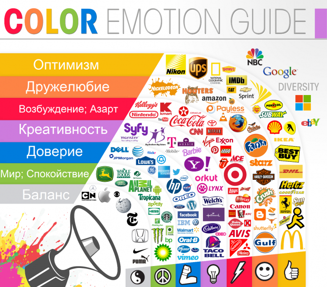
According to the study, red is associated with “energetic color” among the respondents, and also comes to mind inseparably at the mention of sales and a certain urgency. In addition, he carries a powerful energy, causing associations with heart and love, then with blood and cruelty. This color stimulates hunger (it has been scientifically proven that people will call food red mostly appetizing), activities and sometimes aggressive moods. This is a good color as the main logo, but it is not favorable for some types of goods and services, and therefore not the most optimal.
Orange is also “aggressive color” - it calls for action. Here it is recommended to be especially attentive, because subconsciously it is associated with risk. Few brands use this color, but with the right approach, it radiates dynamism, excitement and strong energy. At the same time, according to the hypothesis described in Forbes in 1991, the orange color can “cheapen”, which also requires caution.
Youth, optimism and increased attention - this is how the palette of yellow flowers is associated with the surveyed people of this study. However, it also causes sensation and alertness. As a rule, this color is used to attract the attention of the audience, so it is not always relevant.
At the mention of green one of the first plants to come to mind. Growth, life and renewal - it is nominal that such associations have arisen in the course of research on this color, as well as money, multifunctionality. This is a harmonious color and it is often used in the logos of many companies.
Blue and blue shades are considered the colors leader for logo design - they cause a feeling of reliability and safety - 85% of respondents preferred it to any other color. This color is actively used in the logos of brands of completely different fields of activity - from logos on the websites of government agencies to factories and IT companies. When choosing this color as the main one, it should be remembered that it is popular with other companies, and therefore the overall originality of the logo comes to the fore.
You should also consider the purple color , which is not so often used in the design of logos. And there is a logical explanation for this - people associate this color with something expensive, mystical and mysterious. Therefore, his choice for the basis of the logo requires a competent approach and analysis - quite risky.
It is also worth considering the black and white colors as basic for creating a logo. And if the first is associated with power and might, then the second, as a rule, with purity and truthfulness.
Black is the second most popular after the blue and blue shades in the design of the logo. In addition to the characteristics described above, it is also symbolized by formality, elegance and style. Many popular brands use this color as the base for the logo. Another interesting fact is that a lot of logos, which we recognize as “colorful”, used to be washed in black and white, or even monochrome black. White color is always used in pairs when creating a logo, which is logical, and, as mentioned above, is associated with openness and trust.

But, to summarize, one thing can be said - the choice of color is a rather important point in shaping the overall attractiveness of the appearance of the logo for customers. Logo design should cover many aspects, in addition to one color. A guarantee of a high-quality and attractive logo can be appeals to specialists, such as in Profitmark.ua. Taking into account your wishes and market trends, we will create a logo that will suit you personally!