Logo development is a creative process and is not always easy - there can often be controversial issues between the customer and the performer related to the design of the logo. And then the contradiction between personal preferences and justified design ideas, own and professional opinion comes into force. We recommend that you listen to the advice of specialists, because their experience has been worked out in the practice of many enterprises. Below will be presented one of the most common mistakes in the development of trademarks, familiarization with which will help you avoid failures when choosing a logo.
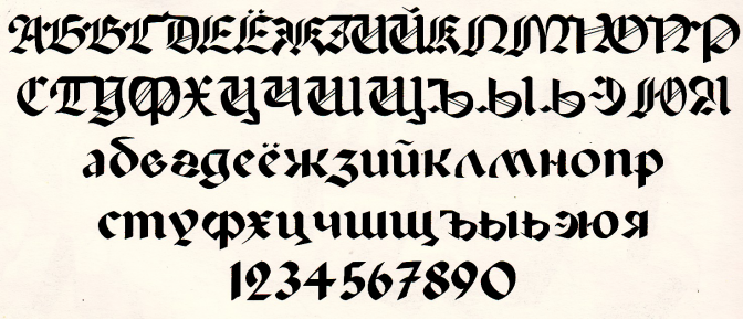
Bad logo font and its design in general

The choice of the font and its role in the overall picture of the logo plays one of the decisive meanings, and it is not surprising, because by means of the inscription on the logo you will be able to identify the future client. For the success of the logo it is necessary to remember that, as a rule, people:
1) The abundance of overloaded and too complex images, including in the design of the inscription, is not welcome. It should be as clear as possible and carry a certain message to the future client or counterparty for cooperation.
2) The abundance of phrases in the logo with different fonts, both in design and density, will not add to its appeal. It is desirable that no more than two fonts be submitted, otherwise it will be disorienting.
3) Creativity in the development of the logo is necessary, but with it you should not overdo it. Standard or vice versa too strange fonts will not be appreciated. The same applies to narrow and too sparse phrases in the logo. We must try to find the "middle ground" in this matter.
4) Haste in the development of the logo should not be in any case, and sometimes the selection of the font can take as much time as it does on its complex design. If an original purchase font is needed for the logo identity, changes to the existing one are required, and perhaps development of a new one - do not be afraid, because this is the “face” of your company.
5) Do not forget about the overall picture. No matter how beautiful the font is, but if it is not suitable for the overall design of the logo or does not fit into the design of the site, it does not fit in with the product / service that you provide, you should not use it. Here it is necessary to comprehensively approach this issue and even strategically think it through.
Too much attention to color or special effect.

The mistake is that these two elements should complement and decorate the logo, but in no case should they be the basis for attracting attention - form and meaning should prevail. Ideally, the logo should look stylish even in black and white design and even then, with the wishes of the customer, be made out in a certain color scheme. By the way, to select the color of your logo, you can read our previous article . Here you can add that:
1) You should not get carried away with layer styles (especially it concerns a falling shadow or relief) only for the sake of “gloss” - there should be a harmonious approach in everything.
2) If you have any doubts, you can work on several options at once, and then choose the best one in your opinion. The more diverse they are, the more complex the analysis will be.
Too many concepts
So say, clarification on the second paragraph. Do not overdo it with “spare” options - besides the fact that it adds a lot of work to the developer, you yourself will lose in the variety of choices - optimally no more than 3 options, depending on the organization and scale of the enterprise, of course. And remember the saying: "The best is the enemy of the good."
Too many wishes, conditions, suggestions
Naturally, we are not talking about unconditionally accepting the claims of designer designers, but it is also not worthwhile to load information without the right to choose. Do not forget that cooperation involves the mutual exchange of ideas, and putting the developer in the frame, you deprive him of "movements". Do not be afraid to trust the experts and express your wishes, just the measure is needed in everything.
The presence of visual cliches
All that we are accustomed to consider obvious - the symbol of the light bulb at the idea, a cloud at the thought and much more is presented as a cliché approach without much effort. Taking into account the fact that these same images are often used in many companies, you should try to avoid them, although they will convey the idea quite clearly. Instead, you should try to use non-standard associations (in moderation) or beat them so wisely that there will be more benefit than harm.
The presence of too abstract images
The reverse side, when in the pursuit of individuality, the logo is so complicated that it is impossible to evaluate and understand it in a go, which, naturally, does not work for him. Obviously, the unique properties of the logo should be, but overloading should also be avoided.
Using bitmaps
Logo design specialists know that it is necessary to use vector, rather than raster images, because when scaled, the latter will noticeably lose in quality. If you like a certain raster image, it will not be difficult for professionals to do this in a special program.
Illiterate use of monograms and acronyms
Comparing to the experience of some well-known corporations, companies, using their example, often wish to use monograms - these are the symbols of the initial letters of the company in the appropriate decorative design. However, here you need to weigh all the pros and cons and assess how well the logo can convey the meaning of the activity for the client. The same applies to acronyms (abbreviation of the initial name of the company) - it is undesirable to use the company, whose name is cacophonous, which will send the message uninformatively when reducing, and also to the company - “newcomer. Acronym can afford a company with a well-established clientele or with a very successful name for such.
Plagiarism logo

Alas, it is necessary to stop at this point. No matter how much you like the logo of another company, “slightly” changing or “repainting” the logo and taking yourself will be a bad idea. In addition to being risky and illegal in terms of copyright, it does not add respect to the company. In the end, your business is not the shadow of someone, right?
findings
Logo design is not easy and requires a lot of time, effort and creativity. Do not hesitate to contact the professionals, for example, in our “Profitmark.ua” - we will help you to make a quality logo that will suit you.