Color, size, relief, form and of course the font - perhaps these are one of the main elements, with successful complex work with which a high-quality company logo is obtained. Now there are lots of ways to highlight your logo among others, and one of these methods is lettering. What is the way to design the logo and what are its features, we consider in this article.
Characterization of the concept of lettering
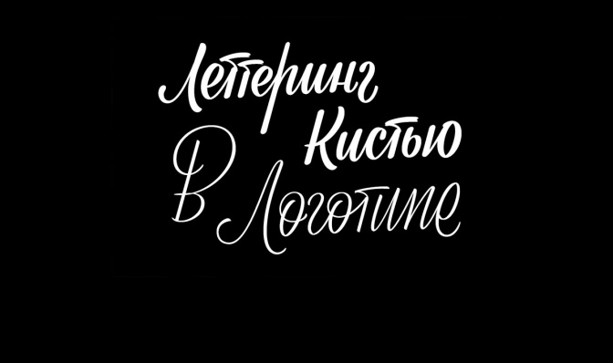
A graphic composition in which the company's symbols, as well as other logo elements are drawn by hand, is called a lettering logo. This concept has much in common with calligraphy, but if lettering is not tied to clear rules and more variable, then calligraphic “beautiful handwriting” exists from ancient names and depends on the technique and power of pressing the pen, sharp movements when writing letters and many other factors. In other words, if lettering is designed to draw letters beautifully, then calligraphy is to write.
What you need to know for literate lettering?
Lettering logo is extremely individual and this is one of its main advantages. However, this is conditional freedom, because when creating such a logo it is still necessary to follow the rules. These include the following:
You must be able to competently understand the fonts.
Much has already been invented before us and sometimes the “original” font drawn in the head is imperceptibly the existing Comic Sans for a long time, which is generally not recommended to be used for the design not only of the logo, but also of the website as a whole. The specialist who risked writing out the lettering style should be extremely competent and understand the psychology, character and font compatibility. One way or another, it will also take a certain font for the base, which will be modified under the original creative way. There is a lot of information about the characterization of fonts, their trend variations for a certain period and much more, but we focus on the basic rules that you need to know to successfully develop a lettering logo:
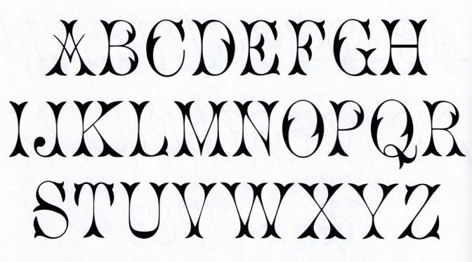
1) It is necessary to know the main font families (geometric, humanistic, and many others);
2) You can combine serif fonts with fonts without those, so as not to overload the image and vice versa;
3) You should not use 2 similar fonts, if the logo assumes two inscriptions different in meaning, it is better to play at a reasonable contrast;
4) Maximum of three font variations in one logo, more brute force;
5) There is a direct pattern of the style of the font and style of the era - no need to unreasonably “mix” them up with each other;
6) There is an unspoken rule not to use certain fonts, because people consider them annoying - besides the ones mentioned above, it can be Papyrus, Viner and many others.
It is necessary to approach especially versatile to the design of such a logo and make sketches
Since a unique, original writing style is created during lettering, it is necessary to work it out extremely competently and critically consider all the options. Multiple rewriting on paper in search of a better location and design of the inscription is also welcome. Since such illustrated letters are not template, it may take some time until there is “the same” for the company logo.
High level of work in the programs for digitizing the lettering logo and its vector variant image
In one of the articles we have already said that the vector image, roughly speaking, the canon, since others, especially raster ones, will noticeably lose their quality in the scale of the logo. Considering the fact that the original lettering logo will in most cases be designed at the beginning as a sketch on paper, you need to be a competent specialist in order not to make mistakes when converting it to a digital form. Obviously, all the specialists - and those that work with fonts in the design of the logo, and individual developers should know this, the bottom line is that the developer has a letter-logo logo with more work on this transfer.
Knowledge of the basics of color designation of the inscription
In one of the articles , we have already talked about the role of color design of the logo as a whole and its effect on purchasing power. The same applies to the color design of the inscription itself. There is a rule of no more than 3 colors in the design, and this is in some cases sufficient to overload the image.
Readability check
Beautiful manual monograms of the initials of the company will be meaningless if they are poorly understood in reading and are forced to strain in order to realize the inscription. Perhaps this is one of the most important rules in the development of original lettering for the logo - ready-made fonts are balanced, and hand-made handwriting may not always be so.
Conclusion:
Lettering logo is an interesting solution for the design of the original logo lettering. Like many other ways, it has its own characteristics, advantages and possible negative phenomena. To design a high-quality logo for your company, please contact our specialists.
